A Beautiful, High-Resolution Map of the Internet (2021)
The beginnings of the Internet were uncharted territory, especially before the days of graphic browsers. You had a number, you dialed up to a location. Certain locations were named after their host universities or government sites and that made sense in an old-school telephone exchange way. But the rest was just a vast ocean of data, of strange lands, and many, many barriers. How big, exactly, is the internet? And how do we measure it? What is the “space” of cyberspace?
There have been maps that overlay the internet’s main landlines onto the map of the earth—this Vox article shows the spidery web growing from the first four locations of ARPANET until the whole world is connected. But that’s not how we think of it. Surely Open Culture is always where you, dear reader, reside, and this writer’s undisclosed location has nothing to do with it. Maybe the internet is really the space that it takes up in our minds, in our lives, and in the amount of internet traffic.
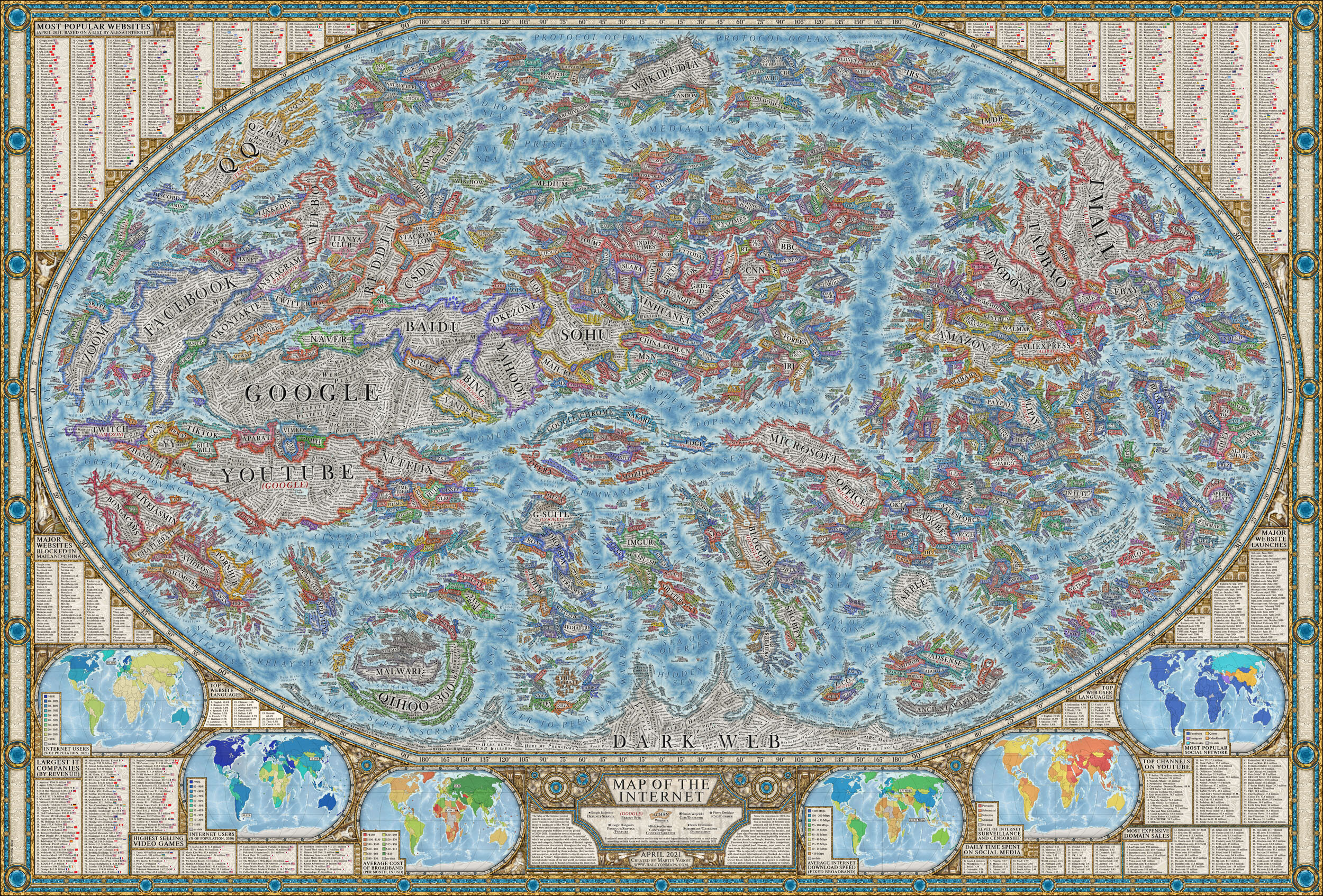
Amateur graphic designer Martin Vargic visualized those spaces as countries on a vast globe inspired by National Geographic Magazine. (Although National Geographic borrowed its cartographic style from some of the first printed maps of the world.) Vargic first published his map in 2014 when he was a student in Slovakia. And now he has decided to update the map for 2021. (See the map in high resolution here.) Large continents represent the main websites of the Internet: Facebook, Google, Apple, Amazon. The seas represent the aforementioned ocean of data under different names: Ocean of Information, North Connection Ocean, etc. To compare his relatively spare original map to the one he just released is to notice how much more crowded this world has become, and how divided.
Vargic based the relative size of each website on its average traffic between January 2020 and January 2021, according to Alexa Rank, the Amazon-owned Alexa Internet’s measure of how popular a website is, calculated by unique users and page views.
However, the center of the map is now different. This now depicts the “core and backbone of the Internet as we know it,” Vargic said. This means a core of service providers surrounded by larger islands of web browsers (Chrome, Firefox, et al).
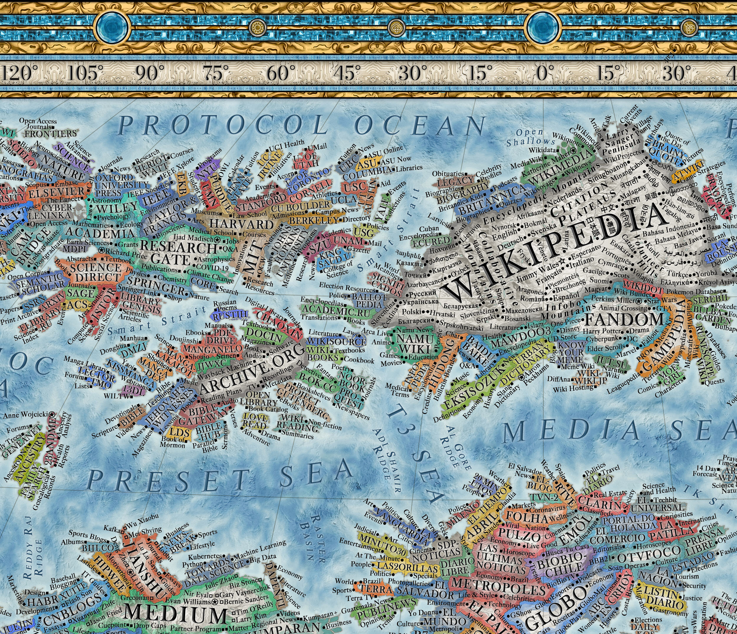
While the 2014 map considered website size as the main organizer and contained around 200 websites, this version contains 3,000. The north of the globe features country clusters: a grouping of academic, research, and free education sites (wikipedia, archive.org, etc.), governmental websites to the east and conspiracy QAnon lands to the west.
The Antarctica of the map? The Dark Web, where the Onion isn’t a parody news site and TOR isn’t the sci-fi/fantasy publisher.
You might find some of Vargic’s decisions odd, or you might just spend your time wondering how much of the internet is indeed an unknown land, with large “countries” you’ve never heard of, but with millions of “residents”. It might not be real, but Vargic’s map will put you in an exploratory mood while you light off for the territories. You can view it in a high resolution format here.
Related Content:
The History of the Internet in 8 Minutes
How the Internet Archive Digitizes 3,500 Books a Day–the Hard Way, One Page at a Time
Ted Mills is a freelance writer on the arts who currently hosts the Notes from the Shed podcast and is the producer of KCRW’s Curious Coast. You can also follow him on Twitter at @tedmills, and/or watch his films here.
A Beautiful, High-Resolution Map of the Internet (2021) is a post from: Open Culture. Follow us on Facebook and Twitter, or get our Daily Email. And don’t miss our big collections of Free Online Courses, Free Online Movies, Free eBooks, Free Audio Books, Free Foreign Language Lessons, and MOOCs.
, The beginnings of the Internet were uncharted territory, especially before the days of graphic browsers. You had a number, you dialed up to a location. Certain locations were named after their host universities or government sites and that made sense in an old-school telephone exchange way. But the rest was just a vast ocean of
A Beautiful, High-Resolution Map of the Internet (2021) is a post from: Open Culture. Follow us on Facebook and Twitter, or get our Daily Email. And don’t miss our big collections of Free Online Courses, Free Online Movies, Free eBooks, Free Audio Books, Free Foreign Language Lessons, and MOOCs.


